We may generate income from the products available on this site and participate in affiliate programs.
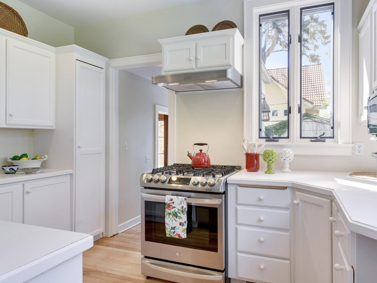
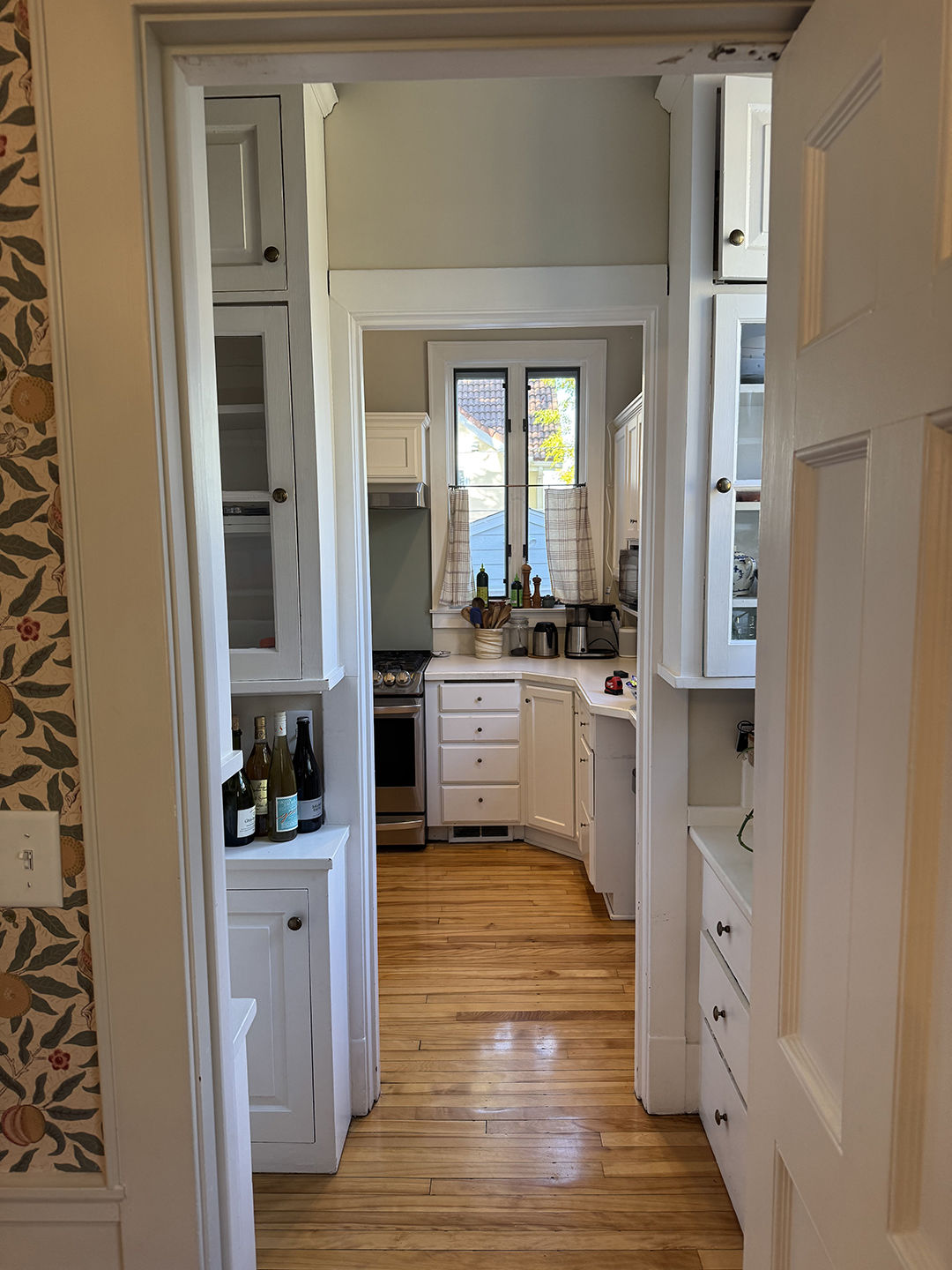
It's common advice to live in a home before renovating so you can better figure out where your weak points lie. However, from the moment interior designer Deidre Webster's clients first walked into the kitchen of her turn-of-the-century Minnesota Craftsman, they knew the awkward layout was a problem. The kitchen had been inefficiently divided into three rooms during a renovation in the 1980s: an area for cooking, a butler's pantry, and a mudroom that housed the refrigerator. “You basically zigzagged through the room,” the designer remembers. It wasn't ideal, but after purchasing the home and hiring Webster's company Studio Day to refresh the rest of the main floor, the couple needed a break from renovating. They moved in and lived in the house – the rest of the rooms renovated, but with the old and clumsy kitchen – for three years, even with two children, before deciding what to do about it.

It was potty training that pushed her to make a change. At first, the couple thought they might do a simple cosmetic refresh in the kitchen. But then they realized how much they needed a downstairs bathroom – running upstairs for every potty break with two toddlers was an impossibility. And even adding a tiny powder room downstairs would require a major kitchen renovation.
Refreshingly, customers didn't want an over-the-top design for their new kitchen. “They have really good balance,” Webster says. “They wanted it to feel down-to-earth but beautiful.” Above all, the family simply wanted a space that functioned better. So Webster's mission was to improve the flow in the kitchen while making it just as beautiful and in keeping with the rest of the house. And of course set up a guest toilet. Here's exactly how they did it.
Explore all possible layouts
Ever since she first saw the house, Webster had been replaying the kitchen in her head. The question of powder room accommodation was a structural puzzle; They wouldn't know what layout would make sense until they opened up the walls to see what square footage was usable. “I went through about seven different plan options,” Webster admits.
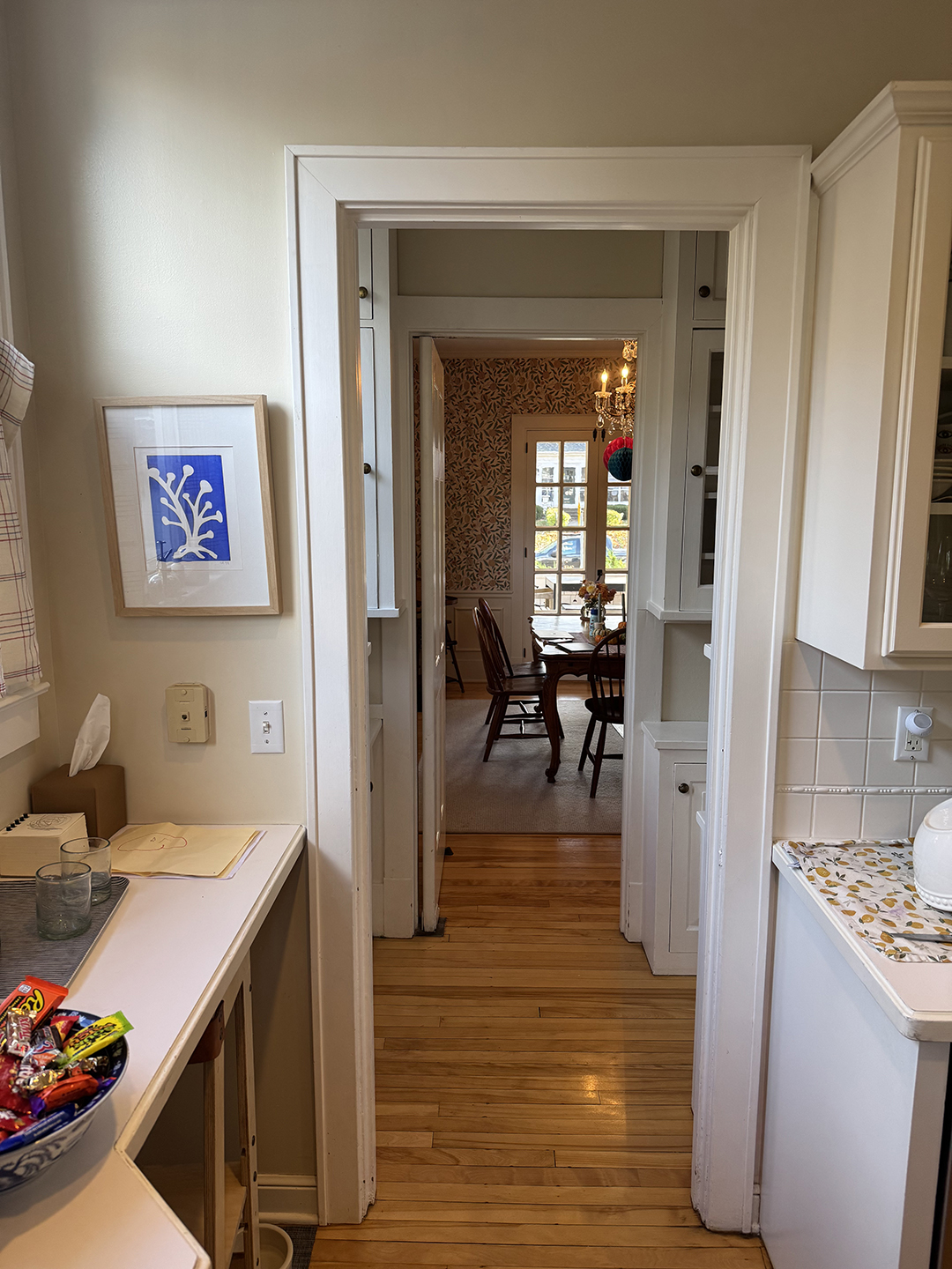
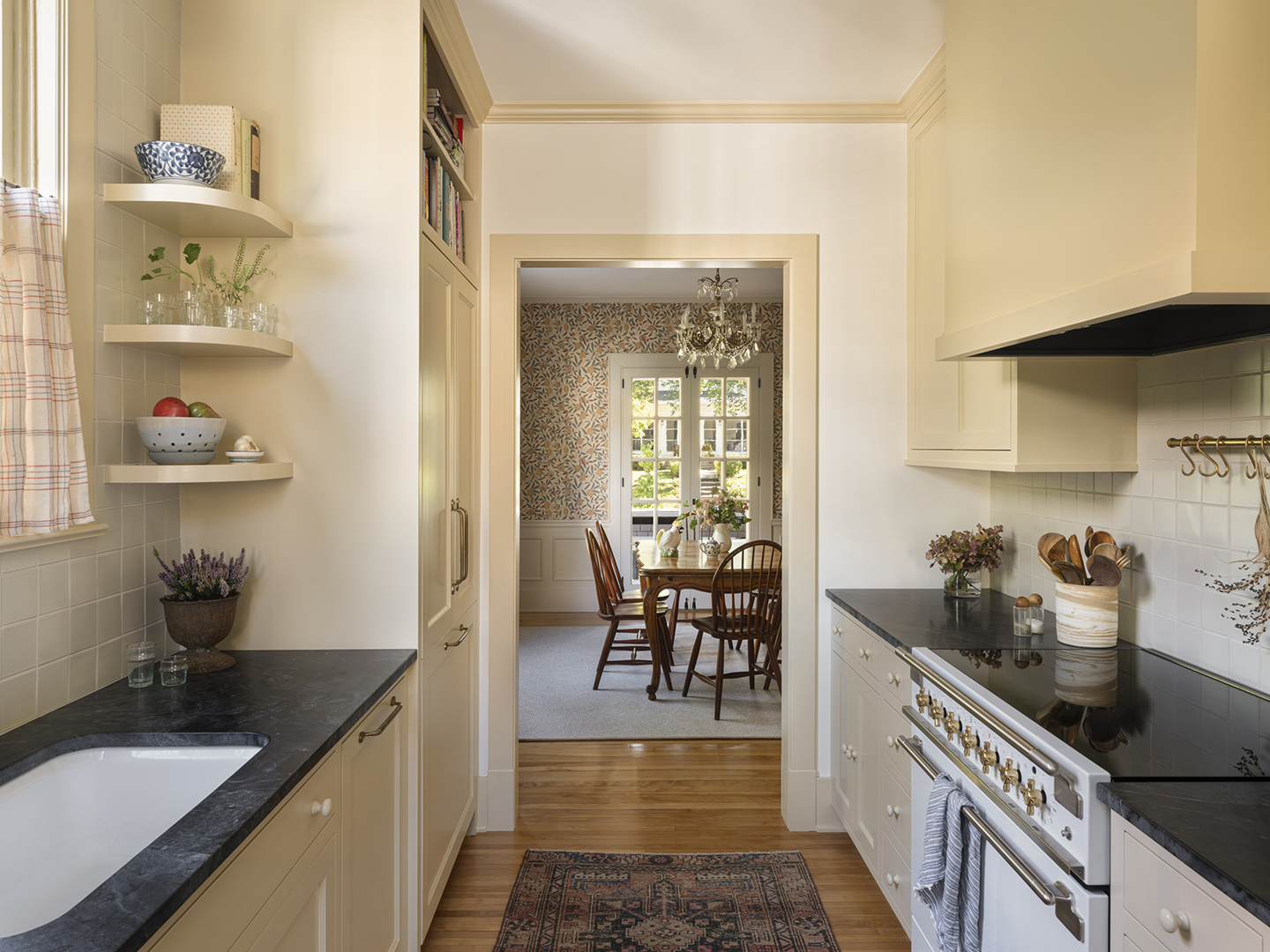
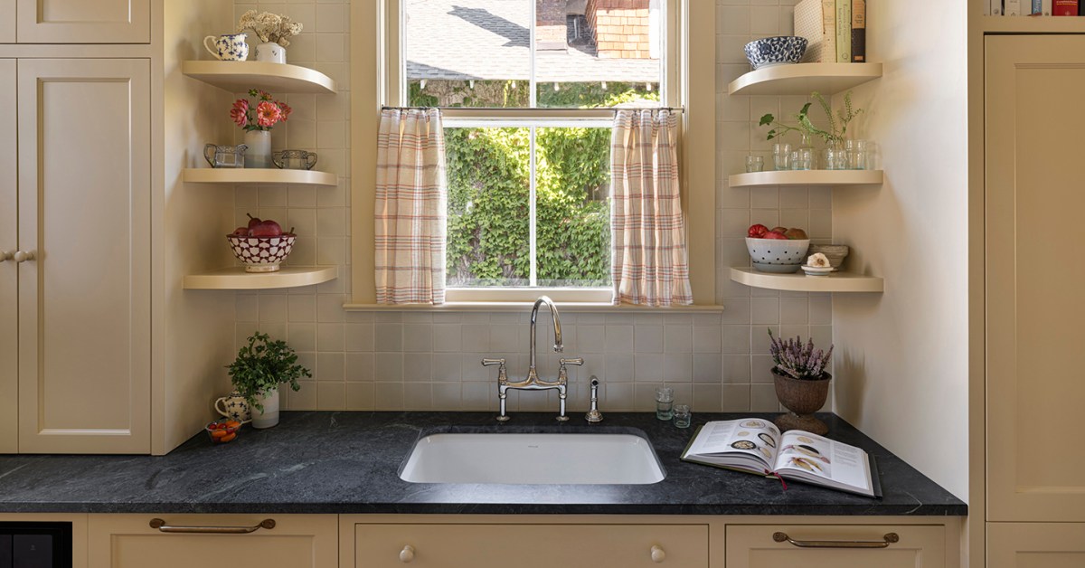
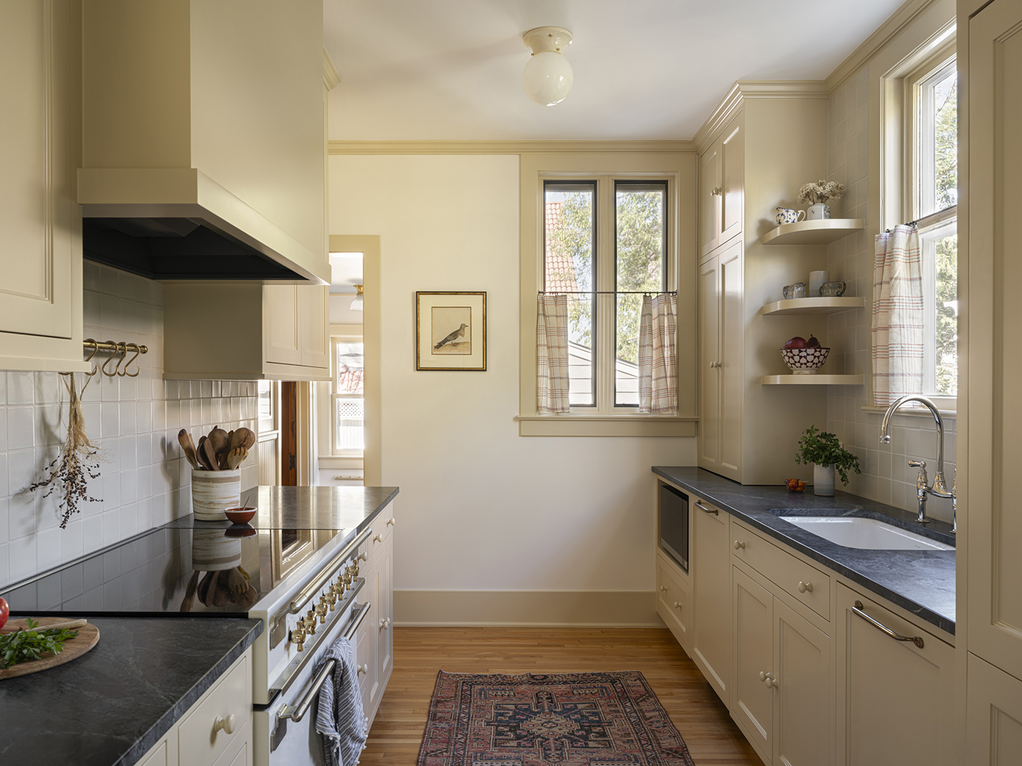
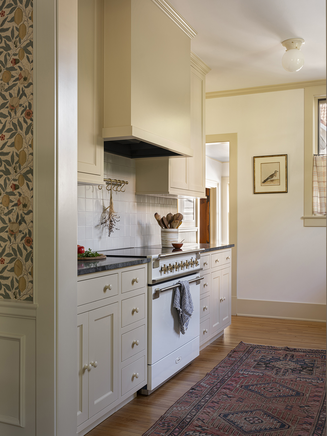
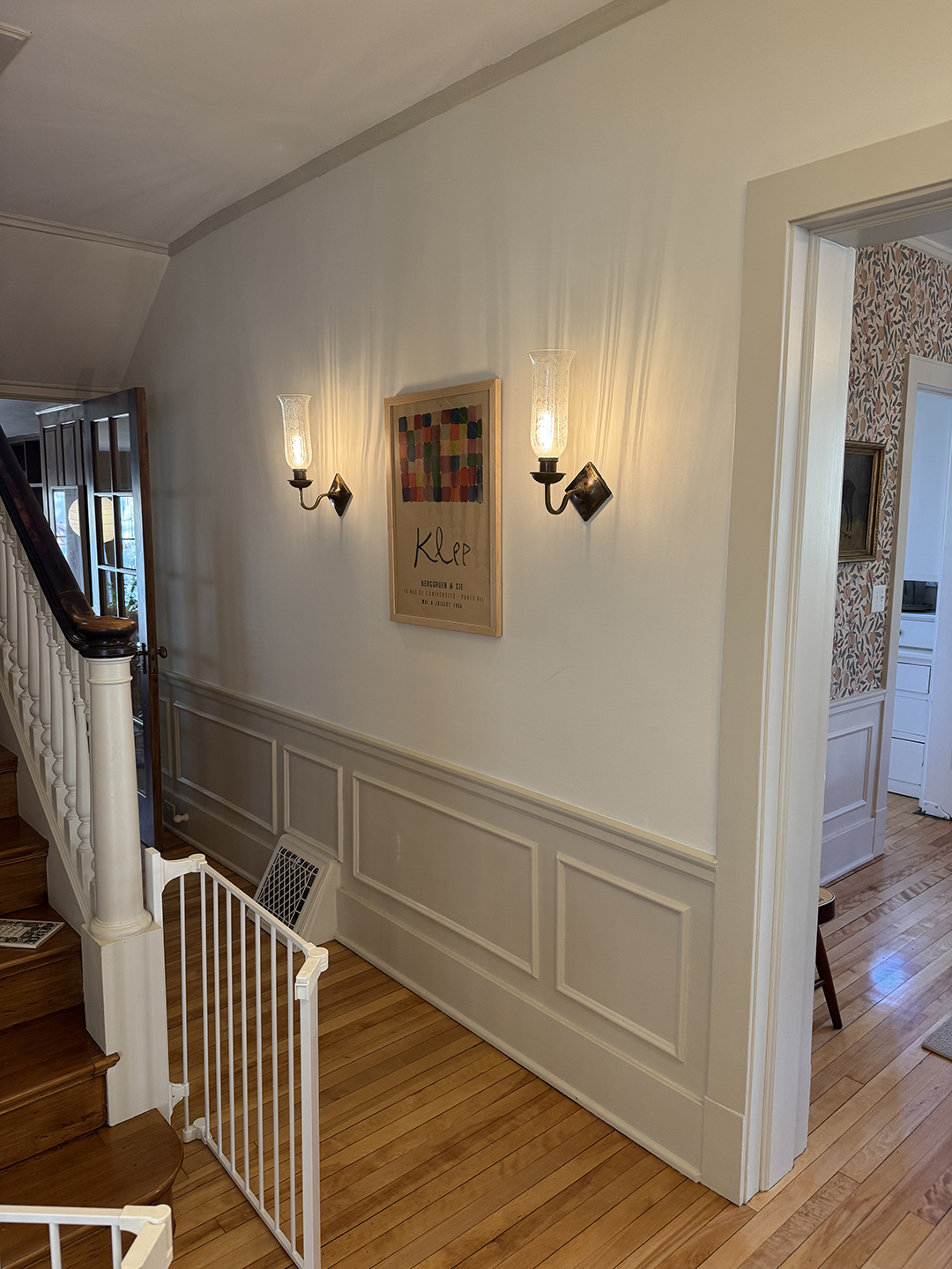
After the demolition, Webster found the inches she needed. By combining the adjacent pantry and butler's cooking area into a single galley-style kitchen, she reclaimed valuable storage and refrigerator space. (She also removed the window in the former butler's pantry to accommodate the refrigerator.) Then, behind the wall of cabinets containing the new stove, she built a powder room just three feet wide, which in turn smoothed the zigzags of the former cooking space into a wide, open hallway. A guest toilet now opens onto the hallway. Webster also removed the door between the dining room and kitchen to use it for the powder room and enlarged the opening.
Choose a style that suits the house
Webster took inspiration from the rest of the house for the kitchen's style and color palette. She chose a recessed cabinet molding that matched the home's original 1905 trim. “Every color comes from the William Morris paper in the dining room,” says Webster (see below). For the trim and cabinets, Webster used one of her favorite colors, Ambient Light from the Magnolia Home by Joanne Gaines collection for Kilz, and sourced recycled hardwood floors to match the home's original floors.
Nod to the past, don't repeat it
The in-house ethos also extended to details such as materials and hardware, without drifting into historical pastiches. The microwave, for example, is clearly visible, and after much consideration, the customers chose a state-of-the-art Aga induction cooker. Her preference for nothing overly fancy led Webster to suggest soapstone for the countertops and painted knobs for the cabinets, two contemporary choices that also balanced the budget.
Frosted glass ceiling lights from MacLaren Fixture Co., cafe curtains, brass hardware from DeVol, and curved shelves around the sink are small details that give this kitchen the charm that modern kitchens often lack. Webster notes that these retro-looking shelves also give the sink and window some breathing room.
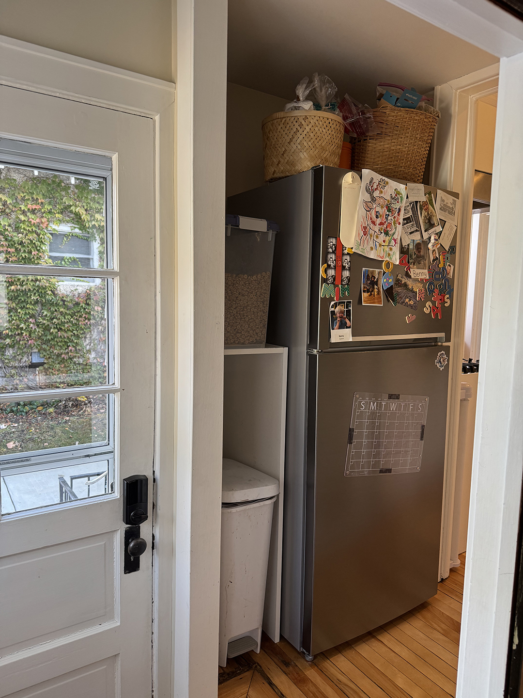
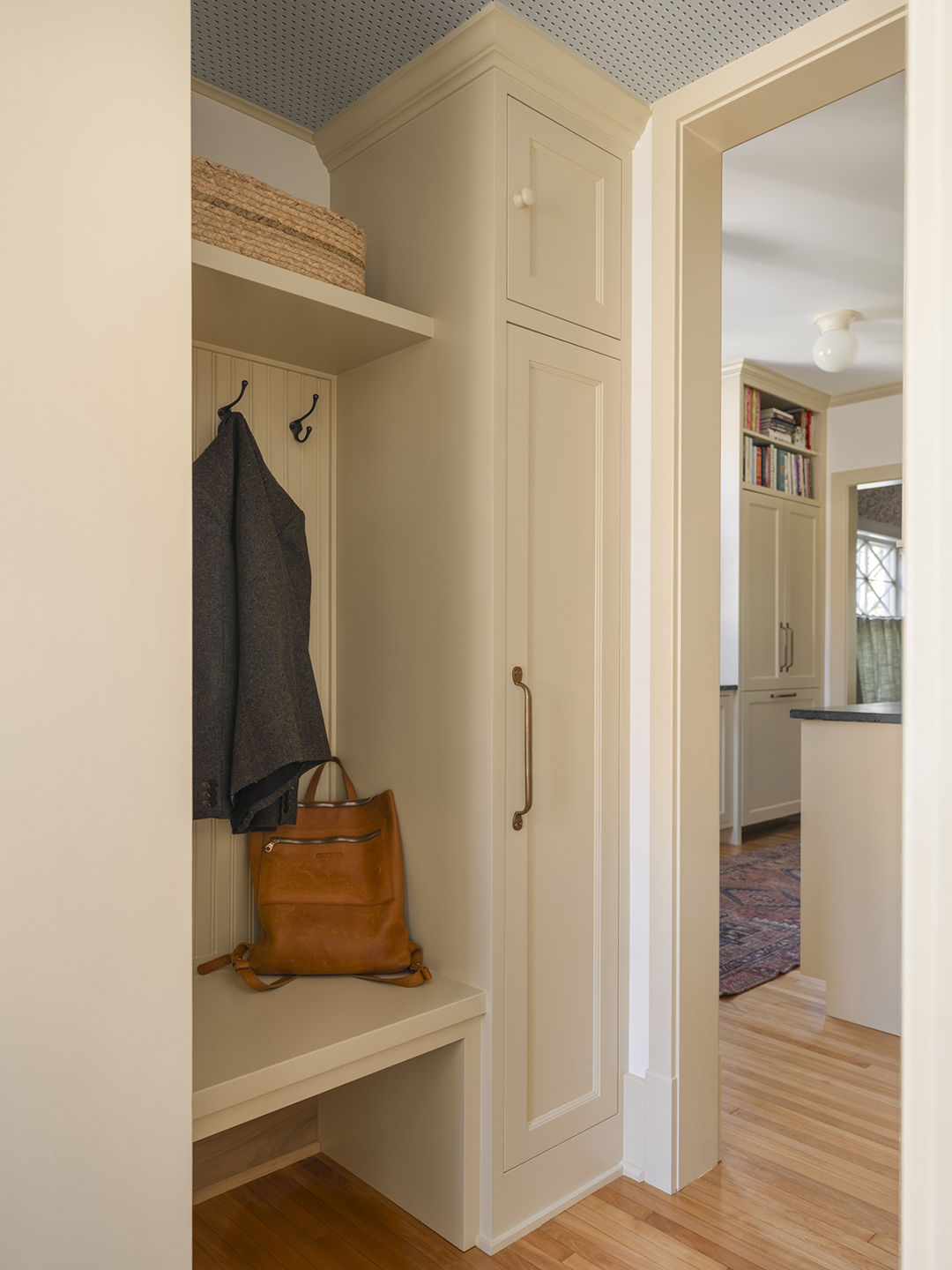
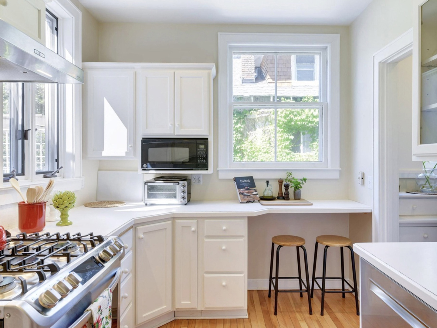
The mudroom, originally dominated by the refrigerator, remained in its original location, with Webster adding floor-to-ceiling storage as well as a convenient bench and hooks. She also cleverly created space for a shallow pantry (not pictured) on the kitchen wall just outside the mudroom. “They lost the butler’s pantry, so we wanted to make sure the storage was really efficient,” explains Webster. A Helene Blanche wallpaper on the ceiling adds a subtle decorative layer to the utility space.
Squeeze into a powder room
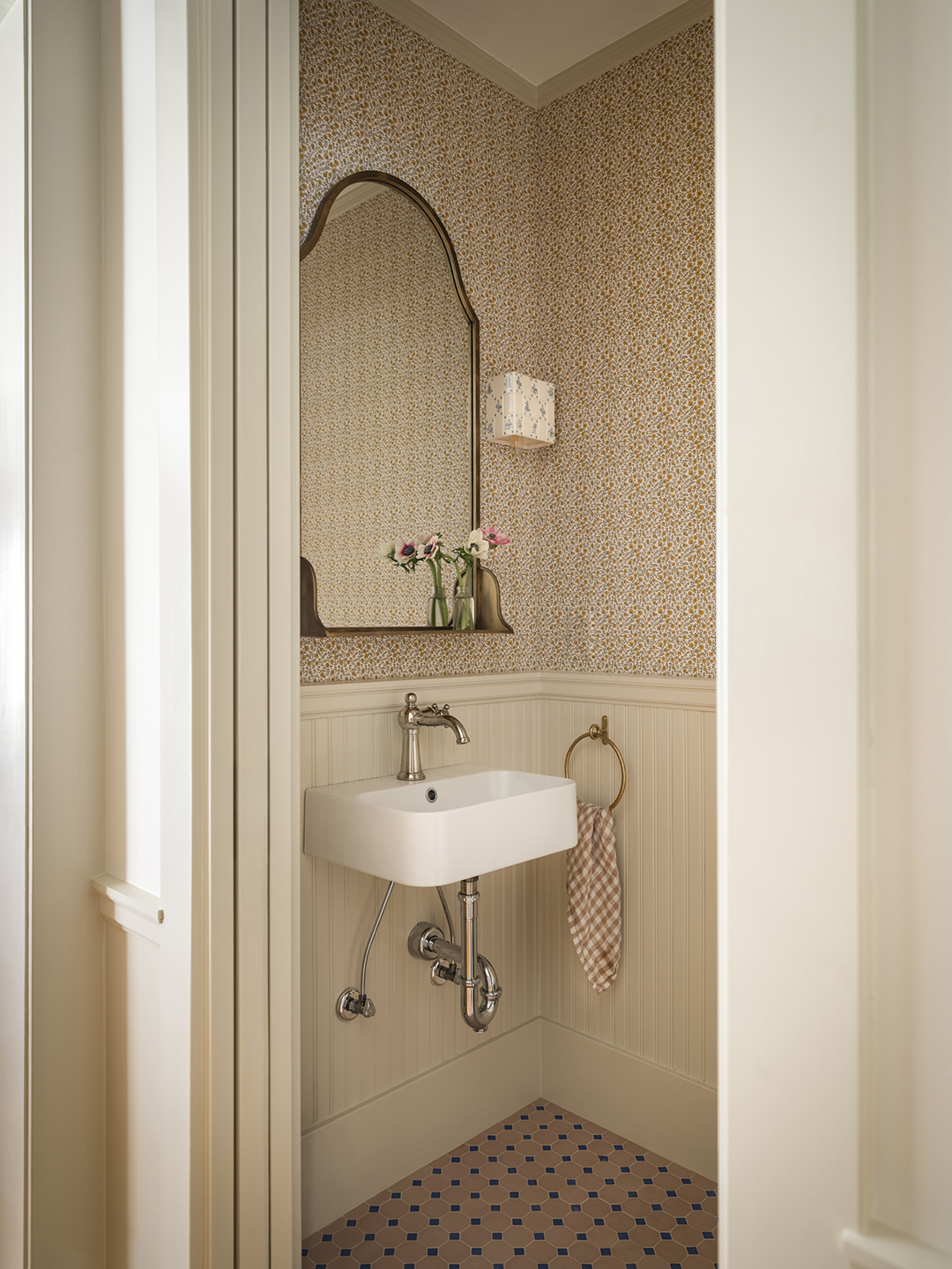
It's hard to believe that adding a downstairs powder room was the main reason for this kitchen renovation. The space that Webster carved out of the old kitchen is so small at just under 16 square meters that there is only room for the smallest sink hanging on the wall. But Webster decorated the space with as much attention to detail as the rest of the house. She lined the lower walls with beadboard and wallpapered the upper ones with floral wallpaper by Sarah Vanrenen, while Delft tile sconces from Huey Lightshop and a vintage ceiling light further enhanced the space.
The new kitchen and powder room make the house feel more at home, which Webster sees as a balance. “It's about sticking with some of the classic things, like the profile of the cabinets, the square tiles and the simple light fixtures, but combining them with nice, updated appliances and a more modern bridge faucet,” she says. “It’s not about being 1905.”